The other side of the hedge
-
01:21:52 pm on February 16, 2009 | # |
Today we’re formally announcing our our 5th ßeta. You see, since we went into public beta, we’ve started something new. We don’t wait for milestone moments to push features and improvements. We just wait for them to be tested enough, and the day we’re happy with them, we push them live. This way, everybody gets the features in an incremental way, and they aren’t dependent on other changes that we might have in mind for that particular milestone. Then, we pick one day and announce all the changes that we’ve made since the last release. Simpler and efficient, ‘innit?
Now, with that out of the way, let’s get started with what’s big this time around. Let’s take these one by one.
Filttr hit big!
Yes, we were pleasantly surprised when Filttr was featured on Techcrunch, albeit with a slightly misleading title (but hey, we’re not complaining). We saw our user base shoot 10 fold thanks to it, and almost everyone was very happy with what he have to offer. Sure, this was about 2 weeks go, but the great thing is that word really spread, and now we see a trickle of new users everyday trying out Filttr and recommending it to people. We hope this growth continues, as we work to add more and more features that’ll make Twitter that much easier for you.

Our first casualty
We had to sadly remove our desktop application a couple of days after the Techcrunch bonanza. While we loved it, we realised that it was not up to par with the Filttr experience we want to offer everyone. Hence, we removed the old application and immediately began working on another one that is going to be better, faster and more feature rich than any other Twitter application out there today. It’s going to remain very easy to use, non-bloaty and did we say fast? We will no longer be using AIR, so that we can leave that overhead behind. We are switching to a better technology, that help us maintain and add features to the application at a frequent rate.
This was a necessary step to avoid falling into the same pitfalls and many other applications have. We did not want legacy code to weigh us down, and a platform roadmap that we weren’t in control of. All this goodness is going to take a little time though, but bringing the application back is our top priority at this point. So hang on, you’re going to absolutely love this new application.
The train-ride continues
But our absolutely awesome web interface continues to be developed and improved with new features and performance boosts. For our more technically sound folks, a geekier changelog is here. But here’s a simpler, more-than-brief low down on all the goodies!
-
Enhanced Replies: Yes! This was one of the biggest requests ever since we went live, that you wanted to see replies to you along with your regular stream. Well, we always like to do that extra bit to make things more than what others make of ‘em. So, we decided to boost your regular replies with any mention of your name in the whole Twitter sphere. It doesn’t matter if that tweet is a reply to you or not — as long as someone mentions your username, you’ll get to see it. How do you like them apples?
-
Aliases, not groups: We’ve revamped our Groups, so that they’re not groups anymore. They’re the most powerful way to receive information there is amongst any other Twitter client today. Aliases are a combination of search and friend groups. You can create an alias with search terms to keep track of those words in the entire Twitter sphere — being able to absolutely pin point what you want to see, and not see. Using the advanced options on the Settings/Alias, you can construct the alias that you want, choosing words you want to see, and words you don’t want to see. You can also choose if you want to search the whole of Twitter, or just what your friends are saying. You can select all your friends, or some of your friends. It is completely upto you, with no restrictions (not from our end, at least). You’re going to love these way more than groups. Believe us! If you find it a little complicated, head over to the Settings page, and things are explained in much more detail.
-
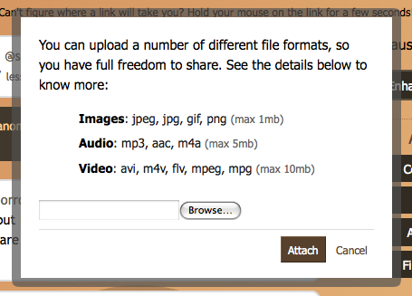
Tweet Attachments: Why just express yourselves in words, or pictures for that matter? Now you can upload audio, as well as video files! With decent limitations, you can now share yourself in many different ways. Completely asynchronous, like everything else in Filttr, you won’t have to leave the page to upload something. Convenient? We thought so. Just click the paperclip icon next to the tweet box like you do normally to attach pictures, and instead of picking an image, pick the file you want to upload.

Oh, and speaking of attachments — you can now see who is talking about that particular attachment right on the page. For example, if you go to this attachment, which is a screenshot of a Twitter goof up with @SwaroopH’s stats, you’ll see at the bottom the tweet that talks about that attachment. This will help you keep track of who all find your attachment interesting. Swell? Great!
-
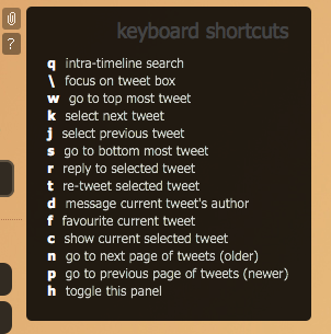
Keyboard Navigation: Since we removed our application, we decided to make our web interface feel just like an application so that you don’t miss it too much. We add a bunch of keyboard shortcuts to make sure that you’ll (almost) never need to use a mouse on our pages again. Click on the ‘?’ icon under the attachment icon to get a list of these shortcuts. They might take a little getting used to, but when you do, you’ll see that you really can’t live without them!

-
User Badges: Tired of clicking away from Filttr just to see information about another user? Well, no more! Now, clicking on any user’s name or handle will show you their info right there. You’ll see their full name, location, their bio, latest tweet — along with if they follow you or not. You can follow or unfollow them right from that box, so you never have to leave Filttr if you don’t want to!

-
Link Information: The tradition of shortening links is both a good and a bad thing. We don’t like the fact that the destination can be obscured by just shortening a link to it, and you’re clueless as to where you’re going before you reach. So we decided to show it to you. Holding your mouse over a link shows you exactly where you’re going to end up. We also re-link the link, so that you are not redirected from the URL shortening service’s page. Less re-directs mean lesser time to reach wherever the link is supposed to take you. If the link is to a media file, we show you the size of that file so that you know exactly how much you will be downloading, before you do. It’s really helpful!
That’s six new things, but these are only the new features! There have been many more improvements to performance and speed under the hood – so the pages should seem snappier than ever before!
oAuth
We have been silently testing our oAuth-based user registration. While other apps can simply create an association with your Twitter account, we cannot – because we’re more than just your average app. Hence, we will continue to have our own authentication system, which will be your credentials to access Filttr. We will link this account with your Twitter account, so that there is a two-level security layer. And you can seamlessly use our different interfaces by using just one set of credentials. If you move from your computer to your mobile phone, you can just go to our mobile interface, use your Filttr credentials, and start using Filttr. No need to re-authorise or jump through more hoops. We believe this is the most convenient way to offer you the Filttr experience, and it goes along with our plans for the future.
oAuth will be revealed whenever Twitter takes it out of beta. We’ll be ready!
We’ve decided to stop saying that we’re not going to add any new features, since we’re obviously not going to stick by it! Coupled with our new way to roll them out, we hope you’ll always keep a look out, waiting for the next big thing! As usual, if you have any ideas and/or suggestions in mind, don’t hesitate to let us know. Have a good day!
-
-
Eph Zero
-
tanveer
-
Kalpik